Driving Sales Through Intelligence
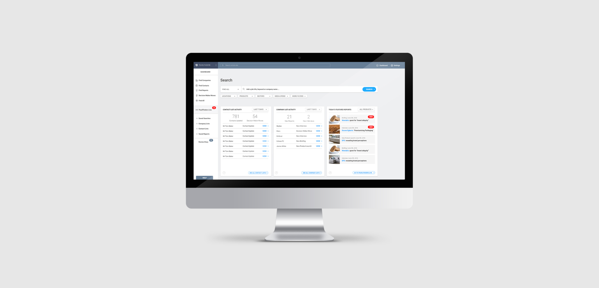
Pearlfinders are a business intelligence platform, providing insights and 'reasons to connect' for sales executives across the globe. With an outdated platform design and a compromised user experience, customers were struggling to make the most of the product.
Tone were asked to conduct a User Experience (UX) audit of the site and re-design the platform from the ground up, with a focus on enabling customers to make the most of the vast wealth of data and insights available and drive up customer retention.
What we did
- Design System
- User Experience
- User Interface
Sector
- Startup
- Tech

“Tone were able to distil many complex features into a unified and coherent product that is not only easy and intuitive to use, but looks great too. ”
Anthony Cooper, Managing Director at Pearlfinders

UI Design Guidelines
The Challenge
Overhaul the User Experience (UX) and User Interface (UI) design of the entire platform, with a focus on driving an increase in user retention and re-aligning the product towards a data driven value proposition.
Scalable Design System
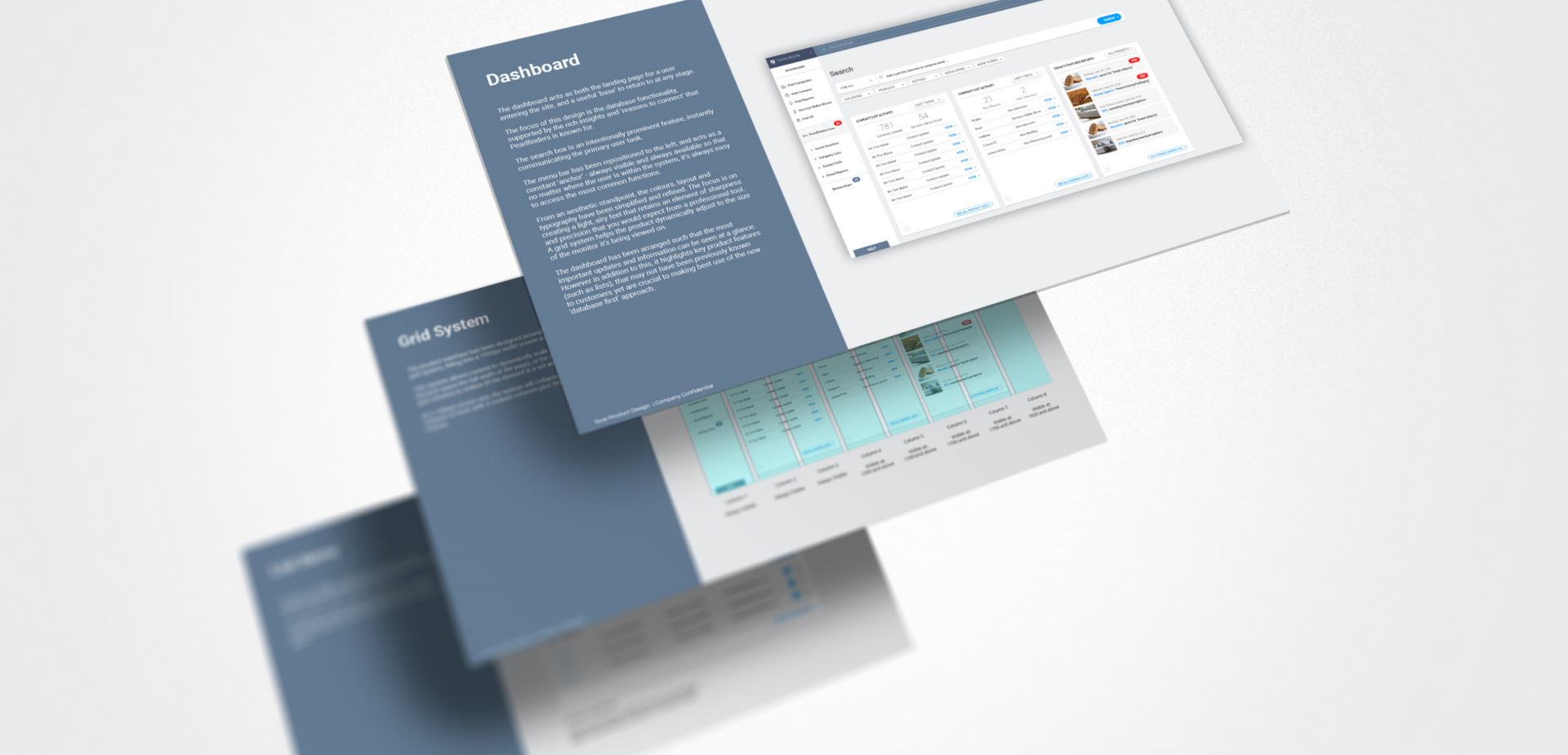
We built a comprehensive design system, which allows Pearlfinders to incrementally build out their product while retaining design and interaction consistency across the entire site.
We created a full design toolkit, including all key components and templates, to make the design of new features simple for the internal development team.