
Creating Clarity and Confidence in a First-of-its-Kind Diabetes Screening System
Glyconics, a UK-based medtech startup, has developed a breakthrough non-invasive device that screens for diabetes using an infrared beam of light through the fingernail. To accompany this pioneering technology, the team needed a companion app to guide users through setup, calibration, and testing - transforming a technically complex medical process into a clear and reassuring digital experience.
Tone was appointed to design the user interface and digital instructions for use, creating the bridge between advanced hardware and an intuitive human experience.
What we did
- Digital Design
- Instructions for Use
- UX / UI Design
Sector
- Diagnostics
- Medical
- MedTech
- Startup
The challenge
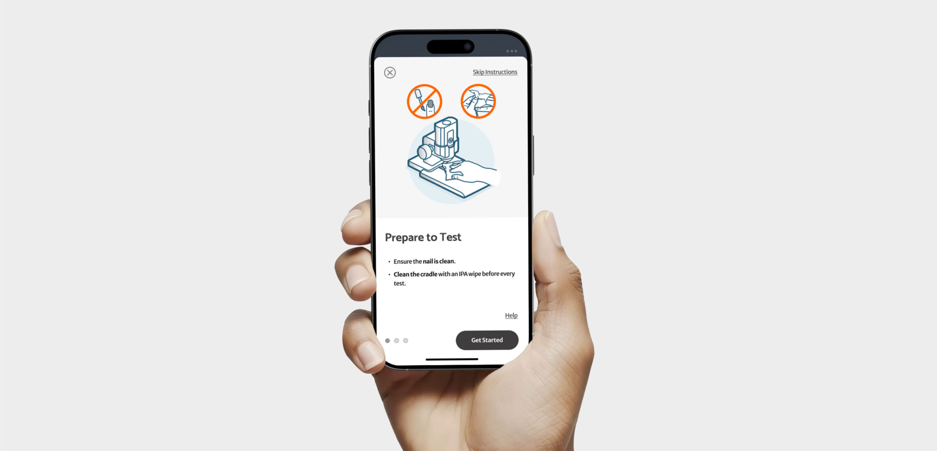
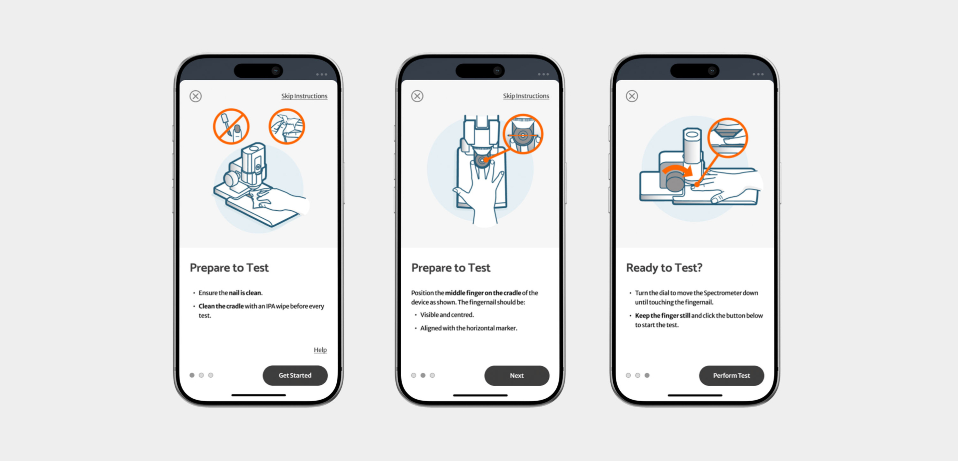
Medical devices demand more than functionality – they require clarity, trust, and compliance. The key challenge was to deliver digital instructions for use that made set-up and measurement steps simple and intuitive for non-medically trained staff, while maintaining a clean, clinical aesthetic across both iOS and Android platforms.
The design needed to communicate essential information with the calm precision expected of medtech devices, yet still feel accessible to non-specialist users. Future scalability and localisation were also vital considerations, ensuring the app could adapt as Glyconics expanded its clinical and commercial reach.
Approach
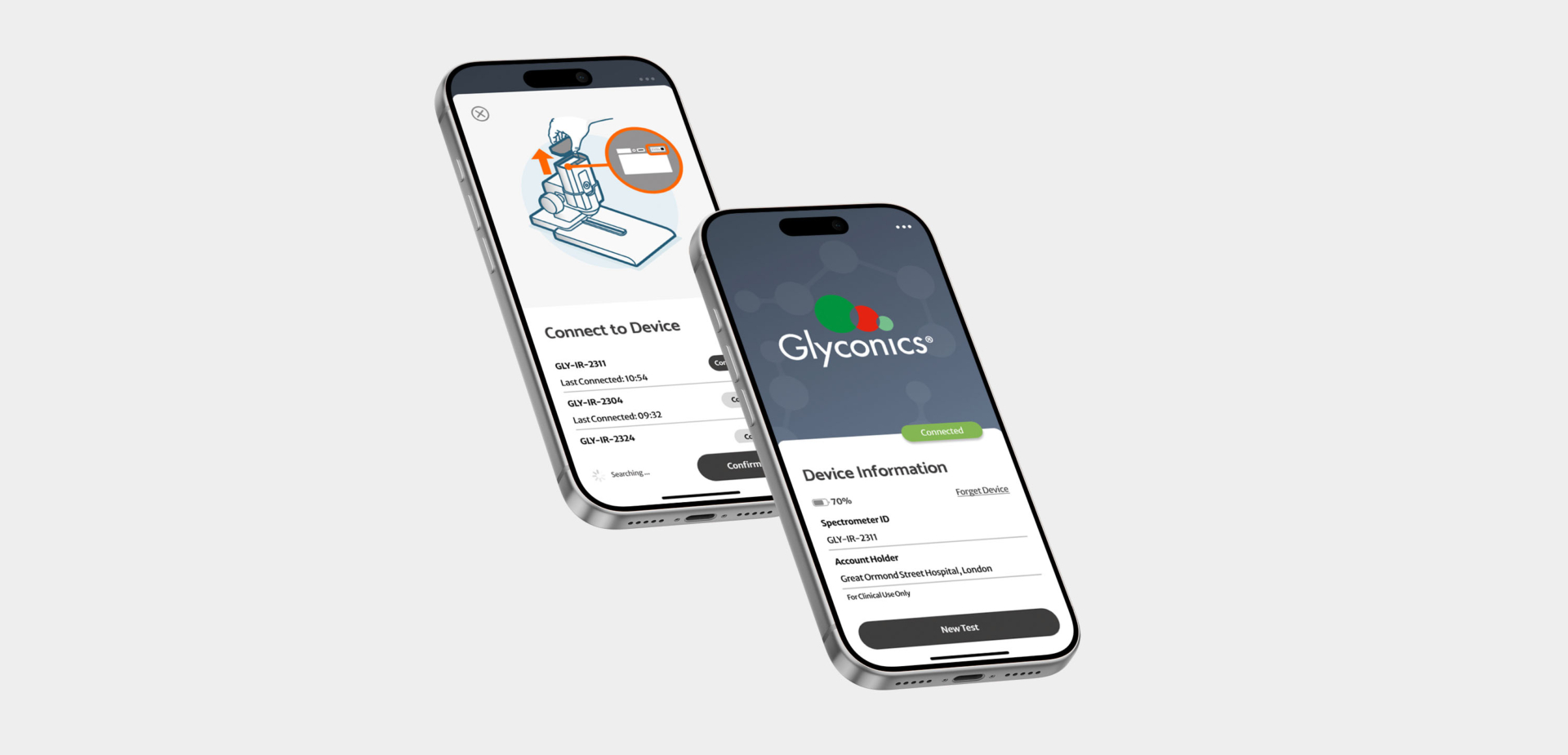
Working closely with the teams at Glyconics and PIX Medical, we began with detailed sessions to map the device workflow, user priorities, and constraints. This informed the refinement of the core user journey, after which designs were wireframed to optimise hierarchy, button placement, and information density.
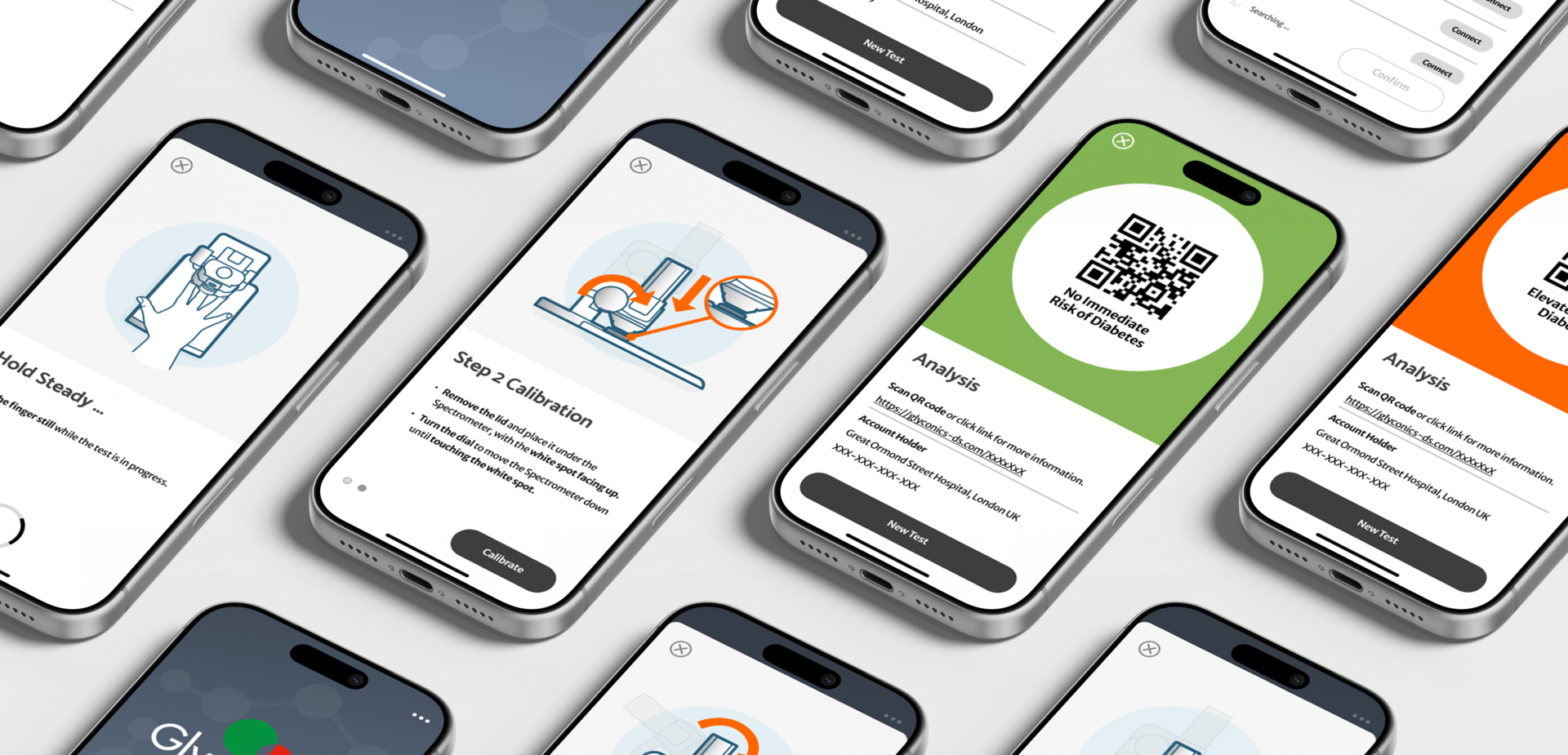
Once the functional flow was set, Tone defined a clear visual direction – a medical interface that balanced cleanliness and warmth. Custom instructional illustrations were created to guide users step by step through calibration, measurement, and interpretation.
We leveraged our extensive experience in the design of instructions for use across all manner of health and medical products to ensure that both the illustrations and copy were simple and easy to understand.
Result
Every interaction is designed to reduce uncertainty and keep the user oriented through each phase of testing. The interface guides users through device connection, calibration, and measurement with a consistent visual rhythm, supported by clear instructional graphics and intuitive gestures. Progress indicators, contextual prompts, and bold colour cues reinforce confidence throughout the process.
The Glyconics app now serves as the primary digital interface for the system, delivering a complete digital instructions for use experience that helps users operate the device confidently and accurately.
Renders by Tone