The psychology of pattern
As human beings we have a visual preference for symmetry and repetition, and are visually attracted to geometric shapes and patterns.
There is something incredibly mesmerising and satisfying about seeing a shape or image repeated in a mathematical order. Some people argue that using geometric patterns is merely an aesthetic tool and a question of taste. But do designers and artists just rely on fashion and their own personal taste? Or are there scientific and psychological reasons why applying a pattern or tessellation to an object is so appealing?
Our obsession with patterns can be traced back to Palaeolithic art or ‘Cave painting’, which provides evidence of some of the earliest human markings known to man. Geometric patterns of dots, lines, cross-hatching and zigzag markings were very common, and significantly outnumber the animal and human images discovered at this time. Most of these markings have been estimated to be over 30,000 years old. But why did our ancestors feel compelled to paint and repeat these patterns on the walls of caves?

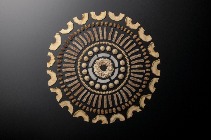
'Things Organised Neatly'
In more recent times, not much has changed. You need look no further than the suitably named ‘Things Organised Neatly blog’ that posts user generated images of everyday objects. These images have been organised neatly into attractive compositions of symmetry, colour, and different grids, hierarchies and tessellations. This practice is thought to satisfy human psychological tendency to organise things into patterns. The practice has even earned itself a new verb: to ‘knoll’ or ‘knolling’.
In 1910, three psychologists, Max Wertheimer, Wolfgang Kohler and Kurt Koffka developed an important hypothesis and theory at Frankfurt University in Germany. They argued that the mind has an automatic tendency to perceive patterns when viewing any given stimulus, i.e. humans naturally perceive objects as organized patterns and objects. Using this hypothesis, they developed a set of rules called the ‘Gestalt grouping principles’. Gestalt does not have a direct English translation from German, but is often translated as ‘Form’, Pattern’ or ‘Configuration’. These principles are often organized into six categories that demonstrate the phenomenon:
Proximity — Elements that are close together appear as a coherent object.
Similarity — Elements that look visually similar will be grouped as part of the same form.
Continuity — We tend to align a pattern together as a group when it has established an implied direction.
Closure — Our perception tends to combine a form to view it as a whole, resulting in filling of gaps.
Pragnanz (simplicity and connectedness) — The stimulus is organised into a simplistic figure that people perceive as one form.
Symmetry — Two symmetrical elements are unconnected, but the mind perceptually connects them to form a coherent shape.
These principles go some way to explaining our preferences for patterns and self-organizing tendencies when viewing objects or images, but fall short of defining the underlying reasons why. Some scientific studies, including one conducted by researchers at the University of Texas have linked the fact we are natural pattern finders to our survival instincts as an evolutionary species. They found an increase in peoples pattern finding tendencies when stress levels were elevated. Therefore, when the brain is on high alert and looking out for threats we assign more patterns to the world around us than usual. They found that the reason for this was to allow our brains to construct a ‘canvas of order’, which allows us to spot the meaningful disorder or threats to our survival amongst the other organised stimuli.

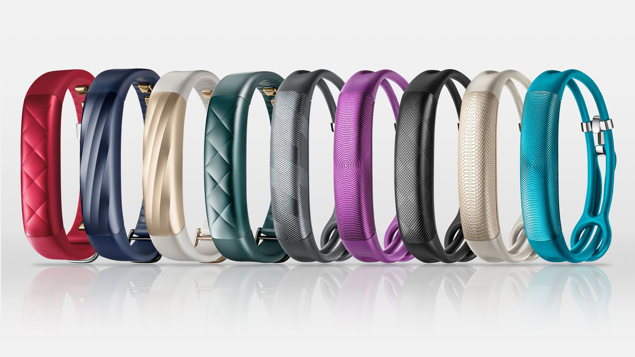
Although our survival instincts may be the cause of this phenomenon, artists and designers often utilise our inclination to do so by constructing a canvas of order that people can enjoy and interpret. Industrial designers are constantly doing this, creating meaningful order amongst the chaos. For example, companies such as Jawbone and Nest are at the forefront of 21st century industrial design; pictures of their work have dominated design blogs in recent times. They use interesting textures and patterns to elevate an inanimate object to an eye-catching device. This distinguishes these companies from their main competition.

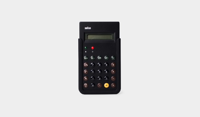
Much of the work of Industrial design veteran Dieter Rams exemplifies Gestalt principles in practice. The principles of Pragnanz, symmetry, similarity and proximity can be observed with the placement of buttons on the famous Braun ET66 calculator. Also, Yves Behar’s contemporary work for a variety of clients more often than not combines the form of a product with various intrinsic patterns that draw on the visual principles of similarity, closure and continuity in order to appeal to the viewer.
The examples given above and the work of many other designers, who knowingly, or unknowingly, apply Gestalt principles in their work, give their product designs an aesthetic prowess, and a resultant longevity that surpasses their competitors. Applying the Gestalt principles does not suit every case. Patterning of visual elements or applying textures may not always be appropriate, and they are dependant on the product’s context of use. However, if they are used appropriately, applying various textures, tessellations and patterns in a carefully considered way can elevate and transform the look of products, increasing the perceived value, and thus contributing to the commercial success of a design.
Read more of our news
What Will Happen to Your Digital Legacy?
Each of us today owns not just a physical legacy, but a virtual one. With every generation living and saving more moments digitally, our ‘virtual estates’ are of ever-increasing personal and financial value.
Read more